Have you ever created a report and find it boring? Or the customer just really wants it to look like how they had created it in Excel? Time to put some custom report layout skills to the test.
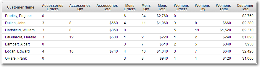
In this example we will take a classic APEX report:
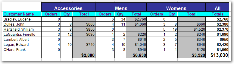
And make it look similar to this Excel layout:
Since this report has a custom layout associated to the data we will build a custom report template. We will create a "Named Column (row template)" report template. This type of report template will allow us to use our report query's column names within our template definition.
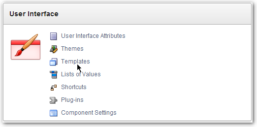
To create the report template go to the Shared Components page and then selet "Templates" in the User Interface panel.
Click the "Create" button and then select "Report" as the Template Type.
Choose the "From Scratch" option and then click the "Next" button.
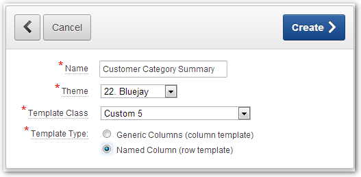
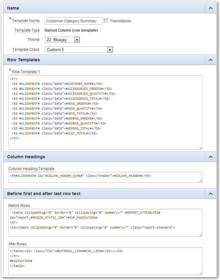
Give the template a name, select the theme, select a Template Class (use one of the Custom options), and set the Template type to "Named Column (row template)".
Click the "Create" button and a very basic version of the report template will be created. So basic, in fact, that if we tried to use it the results would display our report as a sort of jumbled mess. We need to edit the template and add some code to get at least a basic layout.
To help stay close to the theme used in the application and to help including the necessary substition strings I like to begin copying and using code from the standard report theme. It may be beneficial to open another browser window on another screen and have one browser window showing the standard template and the other windows showing your new template.
Relevant sections of the standard report template used in this example are shown in this image:
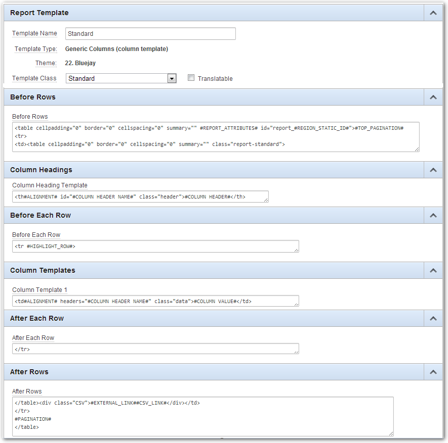
To start with we will copy the Before Rows, After Rows, and Column Headings sections from the standard report template to our custom template.
Next we will use the "Column Template 1" definition from the standard report template to help us build the "Row Template 1" definition in our custom template. Since our custom template is a row template we can't use the COLUMN substution strings and need to remove or replace them.
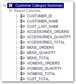
Also since we a defining our report row we can use numbered (5976400346831048,201602091606540151,...) substitution strings, or as in this case, we will use the column name substitution strings in our row definition. In the tree view of the page builder we can see a list of the report columns.
For now, we have the report template looking like this:
When we run the report using our new template (don't forget to change the report template to use the custom template) the report looks close to the standard report:
Now the magical part...Using some basic HTML and CSS skills we can modify the custom report template to look the way we want it to. First we will modify the Before Rows field:
<style>
 .cat-hdr { font-weight: bold;
            font-size: 12pt;
            background-color: #336699;
            color: #FFFFFF;
            padding-top: 10px;
            border-top: 2px solid #000;
            border-left: 2px solid #000;
            border-right: 2px solid #000; }

 .col-header { color: #336699;
               background-color: #CFE0F1;
               font-size: 10pt;
               border-top: 1px solid #fff;
               border-right: 1px solid #fff;
               border-left: 1px solid #fff;
               border-bottom: 1px solid #000;
               padding-left: 15px;
               padding-right: 15px;}
 td.data { border: 1px solid gray;
           font-size: 9pt; }
 td.order { border-left: 2px solid gray; }
 td.data.cat-total  { background-color: #CECECE;
                      text-align: right;}
 td.data.cat-total > b { font-size: 11pt; }
 td.data.cust-total { font-weight: bold;
                      border-left: 3px double gray;
                      text-align: right; }
 td.data.cust-total > b { font-size: 12pt; }
 .report-standard tr:last-child td.data { border-bottom: 2px solid gray; }
</style>

<table cellpadding="0" border="0" cellspacing="0"
       summary="" #REPORT_ATTRIBUTES#
       id="report_#REGION_STATIC_ID#">#TOP_PAGINATION#
<tr class="main-report">
<td>
<table cellpadding="0" border="0" cellspacing="0" summary=""
       class="report-standard">
<tr>
<td> </td>
<td align="center" class="cat-hdr" colspan=3>Accessories</td>
<td align="center" class="cat-hdr" colspan=3>Mens</td>
<td align="center" class="cat-hdr" colspan=3>Womens</td>
<td align="center" class="cat-hdr">All</td>
</tr>
ADDED:
Rows 1-31: The CSS to give the report the look and feel that we want.
Rows 40-46: This adds the top level header row to the report.
Next a quick change to the Column Heading Template field to add the col-header class:
<th#ALIGNMENT# id="#COLUMN_HEADER_NAME#" class="col-header">#COLUMN_HEADER#</th>
and finally a few changes to the Row Template 1 field to add the class defitions for the different columns.
<tr>
 <td align="left" class="data">#CUSTOMER_NAME#</td>
 <td align="right" class="data order">#ACCESSORIES_ORDERS#</td>
 <td align="right" class="data">#ACCESSORIES_QUANTITY#</td>
 <td               class="data cat-total">#ACCESSORIES_TOTAL#</td>
 <td align="right" class="data order">#MENS_ORDERS#</td>
 <td align="right" class="data">#MENS_QUANTITY#</td>
 <td               class="data cat-total">#MENS_TOTAL#</td>
 <td align="right" class="data order">#WOMENS_ORDERS#</td>
 <td align="right" class="data">#WOMENS_QUANTITY#</td>
 <td               class="data cat-total">#WOMENS_TOTAL#</td>
 <td               class="data cust-total">#CUST_TOTAL#</td>
</tr>
Now when we run the page the report will be rendered with the nifty colors and borders.
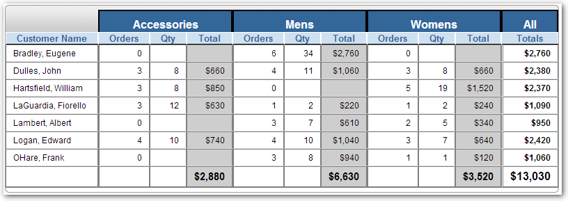
At times, the colors the customer want are questionable, but, adding a little formatting and colors to reports certainly increases customer satisfaction.